 image by
Dirk Schönberger, 18 September 2010
image by
Dirk Schönberger, 18 September 2010Source: adapted from http://www.saojoaquimdebicas.mg.gov.br/bandeira.php

Last modified: 2011-02-04 by ian macdonald
Keywords: minas gerais | são joaquim de bicas |
Links: FOTW homepage |
search |
disclaimer and copyright |
write us |
mirrors
 image by
Dirk Schönberger, 18 September 2010
Source: adapted from
http://www.saojoaquimdebicas.mg.gov.br/bandeira.php
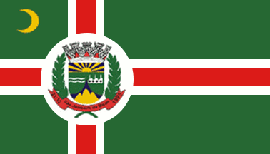
An off-centred red cross, fimbriated white on a green field, with a white disk bearing the municipal emblem, and a yellow crescent in the upper hoist.
Official website at
http://www.saojoaquimdebicas.mg.gov.br/
Dirk Schönberger,
18 September 2010
The page at
http://www.saojoaquimdebicas.mg.gov.br/bandeira.php has a detailed
description of the flag:
"The flag of the Municipality of Săo Joaquim de
Bicas is made of a green rectangular field, has the obverse and reverse strictly
identical, and is quartered by a white cross with another, red cross
superimposed [alt., by a red cross fimbriated in white], charged in its arms'
intersection by a white disk surrounding the municipal coat of arms; in the
upper left quarter is placed a crescent, whose golden colour symbolizes the
wealthy future hoped by our people. The cross recalls that the town was named
after a saint (St. Joachim [the husband of St. Ann and the father of St. Mary]).
The municipal shield is surmounted by a five-towered mural crown, the
universal symbol used on municipal arms, with red ports, symbolizing the
hospitality of our people. The upper part of the shield represents the sky lit
by a radiating sun, symbolizing the influence of the municipal power on all the
parts of the municipality, as well as the spread of our culture all over the
country. Below, two waves argent (left) and a factory of the same (right)
represents river Paraopeba and the local business park, respectively. In the
base of the shield, three mounds or emerge on a blue background, representing
the landscape of our municipality. Below the mountain is placed a figure
representing democracy since the French Revolution (Phrygian cap) [does not seem
to be shown on the drawing of the arms], which recalls the democratic process of
creation of the municipality. The shield is flanked by two laurel branches,
symbolizing for ages victory and are a tribute to those who fought for the
emancipation of the town. A red scroll placed under the shield bears a writing
argent [shown sable on the drawing], the name of the municipality and its
foundation date [21.12.1995]."
[Lengthy description of the heraldic meaning
of the colors skipped.]
Ivan Sache, 22 September 2010