This page is part of © FOTW Flags Of The World website
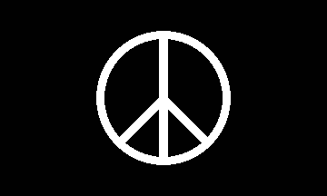
Peace Sign Flag (Campaign for Nuclear Disarmament)
Peace flags
Last modified: 2016-02-27 by randy young
Keywords: peace flag | pacifism | peace sign | rainbow | rastafarian |
Links: FOTW homepage |
search |
disclaimer and copyright |
write us |
mirrors

image by Steve Kramer, 29 May 1996
See also:
The actual colors and sizes seem to vary. I've seen white on black (pictured) most often; others are white on blue, green on white, and pink on black. The most common proportions are 3:5.
Steve Kramer, 29 May 1996
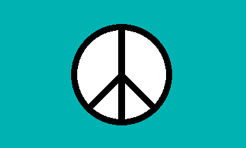
I've seen many colors used on the peace flags, but, heck, I was raised in the Bay Area near Berkeley in California. The turquoise green flag was the first one I recall seeing, but since then we've had a whole bunch of manufacturer variants to deal with. I've seen black, red, pink, dark blue, light blue, forest green, and even white backgrounds. There is even a rainbow version in use. Some appear homemade and some look machine made. Some are faded and some are shiny new. You'd go crazy trying to find pictures of them all.
As far as the upside-down version, or even a flag turned upside-down on purpose, that I've never seen, but then again I've never visited all the demonstrations held here in the Bay Area either. They hold a lot at the universities and cities around here.
Pete Loeser, 11 February 2016
The peace symbol as a convoluted and confusing history. It's most notable appearance in modern times was its first use by the (U.K.) Campaign for Nuclear Disarmament (C.N.D.) at their Aldermaston march in 1958. The C.N.D. meaning of the symbol is semaphore for "N" (the two diagonal lines) and "D" (the two vertical lines). About ten years later, the symbol was adopted as a general peace sign within the student anti-war movement. It became probably the single best known symbol of the youth culture of the 1960s.
T.F. Mills, 9 October 1996
The "peace sign" was designed by Gerald Holtom in 1958. The frequently-repeated but mistaken belief that it was designed by Bertrand Russell probably stems from the fact that Russell was the president of the C.N.D. at the time. The first public use of the symbol was on flags and placards during the 1958 Aldermaston march (in England). It was described in Manchester Guardian articles covering the march.
Bruce Tindall, 28 May 1996
Before his death, Gerald Holtom handed a number of personal documents to his nephew Tim, who in turn gave them to his youngest son, Darius, who now lives in France. Included with these writings are many of his original doodles, which show the process leading up to the peace sign end-product.
Tim Holtom, 8 March 1999
I have been flicking through "Peace - The Biography of a Symbol," by Ken Kolsbun, National Geographic, ISBN 978-1-4262-0294-0.
On page 33 there is Gerald Holtom's original sketch, apparently as presented to Hugh Brock, Michael Randle and Pat Arrowsmith on 18th February 1958. It shows two strip banners to be mounted on pairs of poles, each with the words NUCLEAR DISARMAMENT in the middle. The first one is in black with the familiar CND/Peace symbol at both ends; the second has brown lettering and to the left of that is a square 4x4 chequered flag in purple and white, and to the right of that is a square yellow, purple, yellow horizontal triband arranged in proportions roughly 2:3:2. In the foreground of the sketch are flag-placards of the chequered and triband patterns, and also placards of the 'cutout' version of the CND/Peace symbol, i.e. where the interior spaces within the circle are painted white, against backgrounds that are either red or green. The familiar CND/Peace symbol of white on black does not feature, but there is an explanation for it on page 35: when Gerald Holtam got around to preparing the banners and placards for the march he realised that it was gaining enough publicity to be televised and coloured banners would not show up well on black and white TV - so he chose black and white as the colour scheme for the event that as it turned out made the symbol famous.
On page 35 the American journalist Herb Greer is reported as describing:
"One day, a tall, quietly spoken commercial artist from Twickenham came into the offices of Peace News carrying a large roll of heavy paper. The artist was Gerald Holtom and on the paper he had sketched out a curious insignia in purple and white, which he thought might be useful for the march. On a dark square was superimposed a white circle with a sort of cross inside it, only the arms of the cross had slipped and were drooping against the lower sides of the circle. Holtom had made the design by combining the semaphore letters N and D: N for nuclear and D, of course, for disarmament. The DAC Committee was doubtful at first, but (on February 21st) they decided to accept the symbol. Holtom was delighted and took over the banner arrangements for the march."
It turns out that CND did not organise that first march, indeed they rather shunned it because they regarded it as too radical and preferred lobbying parliament by letters etc. The DAC was the Direct Action Committee Against Nuclear War, founded in late summer of 1957. The National Council for the Abolition of Nuclear Weapons Tests changed its name to the Campaign for Nuclear Disarmament on 27th January 1958 and held its first public meeting on the 17th February which featured speeches by Bertrand Russell and J B Priestley, and then a march to Downing Street which was stopped by some rough police action. They later merged.
David B. Lawrence, 30 July 2009
However, this article disputes that version based on the book by National Geographic Books titled Peace: The Biography of a Symbol, by Ken Kolsbun and Michael Sweeney and state that "pacifist textile designer, Gerald Holtom, who initially considered using a cross but got an icy reception from some of the churches he sought as allies" ( "Holtom brought the design, unsolicited, to the chairperson of his local anti-nuclear group in Twickenham, and alternative versions were shown at the inaugural meeting of the London CND. "The first mark on paper, according to Mr Holtom, was a white circle within a black square, followed by various versions of the Christian cross within the circle. But the cross, for these people, had too many wrong associations - with the Crusaders, with military medals, with the public blessing by an American chaplain of the plane that flew to Hiroshima - and eventually the arms of the cross were allowed to drop, forming the composite basic semaphore signal for the letters N and D, and at the same time a gesture of human despair against the background of a round globe. Eric Austen, who adapted the symbol for Holtom's waterproof "lollipops" on sticks to ceramic lapel badges, is said to have "discovered that the 'gesture of despair' motif had long been associated with 'the death of man,' and the circle with 'the unborn child,'" source) and also the folowing (on the first public use of the symbol): "So on a wet, chilly Good Friday � 4 April 1958 � the symbol as we know it made its debut in London's Trafalgar Square where thousands gathered to support a "ban the bomb" movement and to make a long march to Aldermaston, where atomic weapons research was being done.
The The Aldermaston marches were anti-nuclear weapons demonstrations in the 1950s and 1960s, taking place on Easter weekend between the Atomic Weapons Research Establishment at Aldermaston in Berkshire, England, and London, over a distance of fifty-two miles, or roughly 83 km. At their height in the early 1960s they attracted tens of thousands of people and were the highlight of the Campaign for Nuclear Disarmament (CND) calendar.
The first major Aldermaston march at Easter (4�7 April) 1958, was organised by the Direct Action Committee gainst Nuclear War (DAC) and supported by the recently formed CND. Several thousand people marched for four days from Trafalgar Square, London, to the Atomic Weapons Establishment to demonstrate their opposition to nuclear weapons. Hugh Brock, one of the organisers, records that he was one of thirty-five people to have marched to Aldermaston six years before in 1952 as part of Operation Gandhi."
While Holtom designed the symbol, the U.S Patent and Trademark Office ruled in 1970 that it is in the public domain. It was quickly commercialized, showing up, among other places, on packages of Lucky Strike cigarettes, but also on a 1999 postage stamp after a public vote to pick 15 commemoratives to honor the 1960s. The symbol that helped define a generation is less evident now, but it is far from forgotten."
Pictures of the first protest marches and the symbols used back then, can be seen here and here.
A video can also be found here.
Esteban Rivera, 10 October 2015
The "square 4x4 chequered flag in purple and white" and the "square yellow, purple, yellow horizontal triband" (if purple is substituted for blue) also spell out "ND," as they are the ICS flags "November" and "Delta." I wonder how these were arranged together as a single symbol, as 4x4 and 2+3+2 don't really match, as also yellow and white do not. Maybe that's why the unified "ND" semaphore symbol was preferred?
It would seem that Gerald Holtom toyed with several ways of spelling "ND" and short-listed semaphore and ICS flags. (We could speculate that other included Morse, but not much can be done with "�� ����", I guess.)
Ant�nio Martins, 31 July 2009
The symbol consists of the semaphore letters "N" and "D" (for "nuclear disarmament") inside a circle. The original colors were, as shown in the image above, white on black. According to The CND Story (by John Minnion and Philip Bolsover, 1983), Holtom and other C.N.D. artists pointed out other symbolism in the flag as well: the semaphores together, without the circle, look like a stick figure with its arms outstretched -- "the gesture of a human being in despair;" the circle represents the womb or unborn generations, as well as the world; and the color black represents eternity.
Bruce Tindall, 29 May 1996
Another, presumably "unofficial," explanation is that it is the cross of Christ with the arms drooping in despair. The symbol is also, in fact, the Death Rune of the Futhark runic alphabet. Whether this is an intentional similarity or not, C.N.D. supporters, particularly Christian ones, used to get very uppity when this was pointed out!
Stuart Notholt, 30 May 1996
The C.N.D. (Campaign for Nuclear Disarmament) was partly based on traditional churches, and I think they were also conscious of mixing two historic Christian symbols:
The outer circle, designates EARTH ("waste and void," Genesis 1:2).
The inner design, the "witch's/crow's feet," designate "GOD reaches down" ("with gift of salvation," John 3:16).
With the appropriation of the symbol by the peace movement in the 1960s, non-traditional and fundamentalist Christians (who apparently knew nothing of Christian symbols), placed a Satanic meaning on it, calling it the Witch's Foot, or Crow's Foot (and sometimes Chicken's Foot), or Broken Cross. In the 1980s, the symbol was further appropriated (at least in the U.S.) to represent environmentalism. In this sense, it is rendered as a blue and green imitation of the U.S. flag, with the peace symbol replacing the stars in the canton.
T.F. Mills, 9 October 1996
It is also used on US flags in regular colors, as a pacifism flag.
Ant�nio Martins, 5 December 1999
Still reading "Peace - The Biography of a Symbol," by Ken Kolsbun, National Geographic, ISBN 978-1-4262-0294-0.
Very occasionally the CND/peace symbol that arose out of the semaphore signal "ND" can be seen inverted and apparently this is widely taken to mean uni-lateral nuclear disarmament. I have also heard it described myself as the difference between a figure of a man standing in despair with arms hanging down and by way of contrast a figure of hope depicting a tree growing upwards, branches springing outwards. It is incorpoated into a flag/poster on page 140 as used by the War Resisters League in 1976.
Gerald Holtom himself, designer of the CND/peace symbol in 1958, described the circle with three drooping lines "to mean a human being in despair" (page 51) but later (page 52) "...A change was taking place, and so, I suppose, it no longer seemed right to display a 'despair' symbol. I turned my badge round to UD [Unilateral Disarmament] but I was wrong. If today there are 1,000 million people who subscribe to ND, hat is not enough. If there are 2,000 million pople that is not enough. To subscribe to ND is not enough. One must teach one's children to cultivate, to produce power from gravity, sunlight and wind, (all quite easy) and to learn how to live in such a way that others may live here-after... I like the thought that perhaps my little symbol may be remembered among the myriad of truth; that living truth upon which action may be based."
Gerald Holtom wanted "my gravstone to be carved with an inverted Campain for Nuclear Disarmament symbol" but it actually has two non-inverted CND symbols at its corners (page 52).
David B. Lawrence, 3 August 2009
Not successfully getting a scan tonight to show you the original design, so I'm looking around on the Internet and thought that this website was useful - it shows Holtom's sketch of the proposed DAC Aldermaston march with the signal flags banners that I was describing, and it adds to my report of the semaphore explanation the idea that "The circle, representing the concept of total or complete, surrounds the 'N' and 'D' signifying total or complete nuclear disarmament."
The website further explains the inverted CND sign as "When the peace symbol is inverted the letter 'N' becomes the semaphore code for 'U' which could mean 'universal disarmament' - or, indeed, 'unilateral disarmament.'"
That webpage includes some other material about the historical use of the sign, but this belongs to other cultures and times.
David B. Lawrence, 3 August 2009
Reading "Peace - The Biography of a Symbol," by Ken Kolsbun, National Geographic, ISBN 978-1-4262-0294-0.
( Page 135 ) "In 1970, America celebrated Earth Day for the first time. The nation-wide observation, on April 22, emerged from efforts to bridge the gap between legislative support for environmental protection and grassroots activism." From about this period, Green versions of the Stars and Stripes began to appear - some incorporating the new "theta" (?) ecology symbol derived from combining "e" and "o" (for "Earth" and "Organism"?), creating the "Ecology" flag. Some of these were combined with the CND/Peace symbol in badges (and perhaps in flags, but I cannot find an example) that echoed already existing badges that incorporated the USA's flag.
(Page 136) Greenpeace incorporated both of these symbols on a $2 green and yellow button to raise money for its first (failed) trip to try to stop nuclear testing on Amchitka Island in Alaska in 1971. On later expeditions, a flag appeared that had the word "GREENPEACE" across the middle with the "theta" (?) ecology sign above it and the "CND/Peace" sign below it. I'm not sure, because I've only ever seen black and white photos of them, but I'm guessing that these were white flags with green lettering and the sails of the ship had the same design with the colour scheme vice-versa.
David B. Lawrence, 4 August 2009
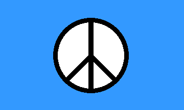
The flag appears in a variety of shades, from light blue to turqoise to teal.
Tomislav Todorovic, 10 January 2016
Light blue variants

image by Tomislav Todorovic, 10 January 2016
Photograph found online of black and white symbol on light blue field. Symbolism and use unknown.
David B. Lawrence, 3 August 2009
An example which is undisputedly light blue was photographed in Jerome, Arizona, on 23 June 2010. The photo of another flag with the same description can be found here, and the flag seen in Santa Cruz, California, on 3 March 2012 also seems to match the description, as well as the one from Minneapolis, Minnesota, which was photographed on 11 August 2007.

image by Tomislav Todorovic, 10 January 2016
Even the flags whose field can be described like light blue sometimes display color which may incline toward turquoise. Such was the case with the flag seen in London, UK, on 5 August 2009, the one from San Francisco, California, photographed on 20 March 2010, or the one photographed on the same day in Washington, DC, while there are also those whose color is not easy to classify, as was the case in Miami, Florida, on 17 November 2008. On some flags, the color should better be classified as turquoise, such as the one from San Francisco, California, photographed on 18 March 2007, the one from Washington, DC, seen on 15 September 2007, or the one photographed in the same city on 6 October 2011, as well as the flag from Le Havre, France, photographed on 21 May 2011. When darker, the color may look more like teal, like the example from Calgary, Alberta, which is seen on 25 March 2012, or the one photographed from Denver, Colorado, on 19 July 2014. But even in those cases, it is not always easy to describe the color, for it may incline a bit towards the blue. Such was the case with the flag from Milwaukee, Wisconsin, which was seen on 3 March 2007, as well as the one from Lawrence, Kansas, which was seen on 10 June 2009. The flag was probably originally meant to display the sky blue color, but was changed by age and weather on some flags, while others might have been modelled after those aged items and created with turquoise or teal color.
Tomislav Todorovic, 10 January 2016
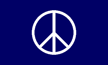
Dark blue variant

image by Tomislav Todorovic, 24 December 2014
The variant with a white symbol on a blue field was photographed as early as 3 July 1970 at the Second Atlanta Pop Festival. More recent examples of its use are from Mendocino, California, dated 24 November 2006 and 25 October 2007.
Tomislav Todorovic, 24 December 2014

image by Randy Young, 21 December 2014; modified by Tomislav Todorovic, 4 January 2015
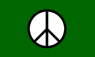
Photograph found online of black and white symbol on dark green field. Symbolism and use unknown.
David B. Lawrence, 3 August 2009
The flag with the dark green field is currently offered for sale at iOffer. Its photo reveals that the color shade is actually FOTW color V++ or very close and the ratio is 3:5, just as stated at the page.
Tomislav Todorovic, 4 January 2015

image by Ant�nio Martins, 5 August 2007; modified by Tomislav Todorovic, 4 January 2015
Yet another variant of the nuclear disarmament symbol we cover at FOTW.
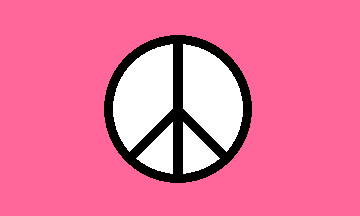
This one is black on pink, regular "peace" symbol, centered on 2:3 flag. I got it from a brochure from the US NGO Mothers for Peace, where it shows a photo of an actual flag. Since, however, the said brochure is printed in duotone black and pink on white paper, this could be a differently-colored peace symbol flag. It is anyway divulged in these colors by Mothers for Peace.
Any other isntance of this coloring, or should we consider this a local US political flag, instead of a design in worldwide use?
Ant�nio Martins, 5 August 2007
I think the image is colored pink, via graphic manipulation, merely to match the overall pink-colored theme of the poster.
Ned Smith, 22 August 2007
I believe this has to do with Code Pink, a feminist anti-war (anti-Iraq war, mostly) group founded a few years ago. I don't think they operate outside the US.
Eugene Ipavec, 22 August 2007
Maybe we'll see this emerge as a feminist-pacifist flag? Less likely flag globalizations have occured in the past, notably the "pace" flag.
I was not under the impression that the flag photo shows an originally pink flag, but rather a duotone colored design. Even so, that is the design that is made public in the leaflet and possibly in other media, and that's what I wanted to represent.
Ant�nio Martins, 22 August 2007
This flag is also for sale online.
Randy Young, 3 November 2014
The only photo currently available at eBay reveals that the field is in deep pink. I modified Ant�nio's original image.
Tomislav Todorovic, 24 December 2014
The photo of the flag with the pink field, which is offered for sale at eBay, reveals that the ratio is 3:5, just as stated at the page.
Tomislav Todorovic, 4 January 2015

image by Tomislav Todorovic, 16 January 2016
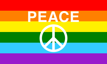
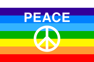
Red, orange, yellow, green, blue, and purple stripes (Rainbow peace flag) with white peace sign and the word "PEACE" in white letters on orange stripe. Symbolism, use, and significance unknown.
Randy Young, 21 December 2014
This flag is used in the USA and Canada primarily as the sexual orientation flag, but sometimes also as a pacifist symbol - an evolution similar to the one which the Italian rainbow flag underwent in the USA, but in the opposite direction. As a pacifist symbol, the flag was used, together with several other pacifist flags, by the members of the Martha's Vineyard Peace Council in 2008, during the July 4th parade in the town of Oak Bluffs on Martha's Vineyard island.
Tomislav Todorovic, 28 January 2016

image by Tomislav Todorovic, 17 January 2016
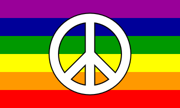
Rainbow flag - violet at the top - charged with a large peace sign in white, fimbriated black, was hoisted in Berkeley, California, in May 2014.
Tomislav Todorovic, 17 January 2016

image by Tomislav Todorovic, 17 January 2016
The flag which adds the peace sign and word PEACE to the pattern of an early peace flag from Italy was seen in Boston, Massachusetts, on 9 June 2007, in Rostock, Germany, on 11 September 2007, and at a peace rally in the USA, exact place not specified, on 30 March 2010. The flag was also hoisted in Pisa, Italy, in early 2010.
The color pattern is: white, dark blue, medium blue, light blue, green, yellow, orange, red; word "PEACE" is inscribed in white over dark and medium blue stripes, larger part over medium blue; white peace sign is placed over light blue, green, yellow and orange, in center of the area comprising these four stripes. The shades of medium and light blue are actually rather close to each other in terms of luminosity, so that it is sometimes not easy to distinguish between them.
Tomislav Todorovic, 17 January 2016

image by Tomislav Todorovic, 24 December 2014

image by Tomislav Todorovic, 2 January 2015
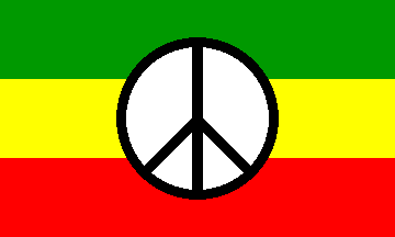
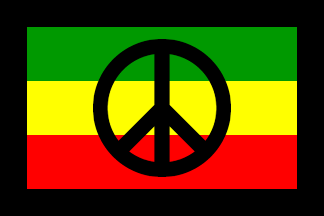
A variant with the field in Rastafarian colors was photographed in Los Angeles, California, on 16 October 2011 and in Santa Cruz, California, on 3 March 2012. Another version of this variant, with the peace sign over the Rastafarian tricolor, no white areas within the sign and black border all around, was photographed in Los Angeles, California, on 15 October 2011, during the Occupy Los Angeles protests.
Tomislav Todorovic, 24 December 2014 & 2 January 2015
See also:

image provided by Tomislav Todorovic, 9 January 2016
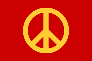
Variant with red field and peace sign in gold color can be seen here. The photo was taken during the East China Sea voyage made by a Greenpeace team in October and November 2015 on the ship Rainbow Warrior. It makes part of the photo album posted here.
Tomislav Todorovic, 9 January 2016
I have a sneaking suspicion that the colors of the flag were deliberately chosen to mimic the colors of the Chinese flag, since the Greenpeace mission took place in the East China Sea. If so, I wonder if there have been other instances of the Peace Sign flag being displayed in colors from a specific national flag in order to send a message to that country?
Randy Young, 9 January 2016
This is an interesting idea and requires more exploring, both about this particular flag and the others which might exist. Until more info is revealed, nothing could be said for sure, though.
Tomislav Todorovic, 10 January 2016

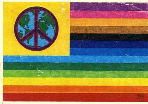
image provided by David B. Lawrence, 3 August 2009
Yellow canton with globe as background for dark blue peace sign. Field composed of stripes of purple, pink, orange, brown, black, dark blue, medium blue, light blue, dark green, light green, yellow, orange, and red. Actual use of design unknown.
Randy Young, 21 December 2014

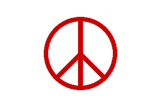
image by Tomislav Todorovic, 2 June 2015
Photo of the flag with dark red peace sign on white field is shown at a Belgian news portal.
The text, which announced a pacifist action in Belgium - hoisting of peace flags throughout the country from 21 September to 7 October 2009 - does not reveal the origin of the photo, so it cannot be decided whether the displayed flag was used at that time, nor anything else about it. The colors set might have been borrowed from the International Banner of Peace (Roerich Movement flag), although nothing can be said about it with certainty.
Tomislav Todorovic, 2 June 2015

