Last modified: 2013-12-09 by zoltán horváth
Keywords: error | acv | sun: 8 rays | star: 8 points (fimbriated) | oak |
Links: FOTW homepage |
search |
disclaimer and copyright |
write us |
mirrors

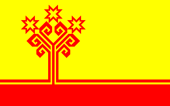
This is often seen in chuvash flag poles: It is
like the real flag, but with the central device offset
towards the hoist. A closer observation reveals that
those are simply normal flags
wrapped around the pole by the wind… Too my big
surprise however, I found this design depicted as
the chuvash flag in an official location: In the main
entrance of the Federal Arbitration Court
(Федерального
Арбитрацический
Суд) of Ĉeboksary, a fassade
plaque shows the russian coat of arms
(including the red shield) between two flag depictions:
dexter, the russian tricolor; and
sinister, this unusual depiction of the chuvash flag — the
normal flag shows in this same position in other federal
and local facilities’ fassade plaques…
António Martins, 01 Aug 1999

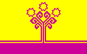
This flag is listed under number 91 at the chart Flags
of Aspirant Peoples [eba94] as:
«Chävash’ Jen (Chuvashes) - Central Russia». It is not only
purple, but with three eight-pointed
stars instead of the three suns.
Ivan Sache, 15 Sep 1999
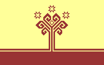
In the leaflet The first acquaintance — Cuvashia: on the threshold of the new millenium (by Kanal 5 Plus Advertising Agensy (sic!), publ. Min. of Foreign. Relations of the Chuvash Respublic, ref. I-1916-700-96), an artistic rendering of a Chuvash flag flying against a cloudy sky superimposed on a map of the republic was made using these colors:

Not a big error, the colors — these shades would be
in the acceptable range for a
real flag
(even if not by large…). However, a more careful look would
reveal not only wrong proportions in the stripes that make
up the oak’s trunk and in the size of the suns (wich also
would be acceptable deviations…), but especially the
presence of a thinner square between the two central coils!
(Can you tell it? Many chuvashians, exposed to that flag
almost every day since 1992, didn’t noticed the mistake.)
I suppose that this thinner square is an artifact derived
from the use of a rendering of the
coat of arms of the Chuvash
Republic as clipart to build that flag image. The coa has a
thin lining contouring the oak against the shield’s background
and the artist simply forgot to erase the remaining isolated
part of it inside the two central coils. This theory is
also consistent with the incorrect width of the stripes and
size of the suns.
António Martins, 15 Sep 1997
I’ve seen this error again and again,
in a number of other depictions.
António Martins, 01 Aug 1999

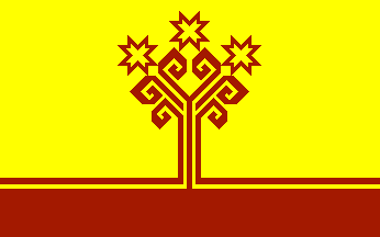
In spite of the vague legal description, the
Color
Code page of the Catalonian Vexillological
Association, based on [jtn99a] manages
to define this shade as its ID107, aka rM++, aka RGB 64 10
0… (please note that the RGB values given are in precentiles,
instead of the usual 0-255 range — that’s the motive for the
incorrectely interpreted almost black shade previously hosted here.)
António Martins, 21 Nov 1996, 09 Oct 1999 and 06 Apr 2007