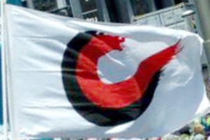
 image provided by John Veitch, 1 December 2015
seen at the People's Climate Parade, in Christchurch, 28th November, 2015

Last modified: 2016-04-16 by ian macdonald
Keywords: canterbury | quartered | rugby |
Links: FOTW homepage |
search |
disclaimer and copyright |
write us |
mirrors
See also:
 image provided by John Veitch, 1 December 2015
seen at
the People's Climate Parade, in Christchurch, 28th November, 2015
The bold design of the Canterbury Flag is a symbol of partnership, the partnership of the maori and the pakeha, of the past and the future, of the people and the land, of the mountains and the sea. The Canterbury Flag is first a white ground, the long white cloud, the snow on the Southern Alps, but also the tabula blancus the empty place where we make our mark or the Japanese idea of "ma" a special place to be.
The mark or symbol on the flag is a wave. The flag is declaring «the mountains and the sea». This is the wave of progress, the wave of our future. The upper edge of the wave clearly illustrates water which comes from the snow and lies deep in the ground. Canterbury is proud of the purity of it’s snow fed underground water resource.
The symbol on the flag is also uses the predominant shape and colours of maori art. «On the land between the mountains and the sea are the Ngai Tahu people». The Ngai Tahu tribe represent the first wave of settlers.
Viewed in another way the symbol on the flag is the letter "C". This is the "C" of community, of confidence and of courage. This is the "C" for Canterbury, a name which carries the hopes and dreams of the second wave of settlers in this province. Canterbury is a place of great spiritual importance, a place of pilgrimage and the seat of high religious office.
The symbol on a white ground is the mark that we make, the image of our work, our play and our lives here. This is unfinished business, the brush-stroked edge of the symbol suggests that there is more to come, that the work of making our mark is not over.
The colour red is usually accepted as the colour of human endeavour, of effort and sacrifice. The colour black is the symbol of the soil. Together the people and the soil make the future of the province. The tight bonding of the red and the black demonstrating the closeness of partnership. Every person who understands the symbolism of the Canterbury Flag adds his or her own contribution to that partnership.
The designer of the Canterbury Flag was Patrick Leeming. His original vision
was to represent «confident Canterbury» in his symbol. The person who has
added most to “understanding the flag” is a Canadian post-graduate student,
Vince MacDonald, who with the vision of an outsider was able to see in us
things we know about ourselves but fail to express. Every person brings to
the flag his or her own vision or meaning. The Canterbury Flag will become
what the people of Canterbury want it to be.
Dov Gutterman, 9 January 1999, quoting from http://www.nzdances.co.nz/public/flag/flag.htm
I believe this flag is part of a promotional effort
for Canterbury, possibly tourism-based. Wellington City
(not province) has a similar flag used by the City
Council. Judging by what it says about the history
of the flag (the link at the bottom), it is probably
official as far as the local authorities go, but
probably not recognised by the central government. As
the provincial system was
terminated some time ago, leaving us without any official
boundries or regions, I don’t think the government
recognises any flags.
Thomas Robinson, 11 January 1999
The Canterbury flag (a C on a white background) was the result of a
competition held. Many hundreds of people sent in designs but when the C flag was chosen,
most people were disgusted, the idea of a provincial flag dropped, and
the flag was only ever flown by a few businesses, and has now
disappeared, although I do occasionally see one every few years.
Phil Day, 2 June 2009
The "Canterbury Flag" was selected from over 100 entries in a competition run by the "Pride of Canterbury Trust". I was on the committee of that trust. The committee chose eleven flags to put before a panel of three judges.
The winner was Patrick Leeming. He call's his flag design "Confident Canterbury".
The flag was widely flown for 12 months, but the Pride of Canterbury Trust ran into problems in getting it widely flown. In particular at sports grounds and with our new professional era, the rule was "sponsors flags and logo's only". We couldn't get the top teams to carry our flag for us.
However, thirteen years later I can see the value of what we did. There is an "official flag" that people can genuinely call their own if they want to, that does
not belong to a commercial sponsor.
John Veitch, 1 December 2015
![[ Canterbury quartered sport
fan flag ]](../images/n/nz-cy2.gif) image by António Martins
image by António Martins
In Canterbury (the area around Christchurch),
a design quartered red and black is most common,
in the national rugby union competition (The
National Provincial Championship), waved by fans
at the grounds.
James Dignan, 12 September 1996
![[ Canterbury stripped sport
fan flag ]](../images/n/nz-cy1.gif) image by António Martins
image by António Martins
The usual sport’s fans flags are horizontally striped
(usually 6 stripes) red and black.
James Dignan, 29 March 1999
I have seen the
quartered Canterbury flag
in use as a sports flag, as well as the striped one.
The striped flag is usually quite a bit shorter.
James Dignan, 5 April 1999
There are, however, no standardised
designs for provincial flags.
James Dignan, 12 September 1996