Last modified: 2013-12-04 by antónio martins
Keywords: globe (white) | bolak | vikto | flower (orange) | sun: 8 rays | occidental | interlingue | yin yang | interlingua | latino sine flexione | map: world | eagle | europanto | language: constructed | linguistics |
Links: FOTW homepage |
search |
disclaimer and copyright |
write us |
mirrors
There are nowadays maybe six or seven “living artificial
languages” — from a total of several hundered “dead”
ones, with new ones popping every year. The other “living” ones
(meaning that a speaker community, however small, does exist), as far as I
know, are
Interlingua (IALA),
Klingon,
Lojban,
Quenya,
Ido,
Volapük (sort of),
and, of course, Esperanto.
António Martins, 04 June 1999

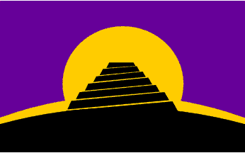
The conlang flag represents both the Conlang mailing list, and language inventors and constructed language aficionados worldwide. It was flown at the 1st Language Construction Conference in Berkeley, California in 2006. The general idea of the conlang flag was decided as a result of a poll of the subscribers of the Conlang mailing list in 2004. The first proposal that included the Tower of Babel was submitted by Jan van Steenbergen, and the first proposal that included a rising sun was submitted by David Peterson. Multiple list members submitted designs that combined the two elements, the first of which was by Leland Paul. The final version of the flag was drawn by Christian Thalmann, who has released it to the public domain.
The flag depicts a silhouette of a ziggurat in front of a rising sun. The ziggurat is a reference to the biblical story of the Tower of Babel, representing language and linguistic diversity. The terraced structure of the ziggurat is also an iconic representation of the way a typical artistic language is created piece by piece, and is never quite completed. The rising sun represents the rise in notoriety and recognition of language construction as an art form.
The following Pantone values were used for the flags flown at the 1st LCC: black: Pantone Black; yellow: PMS 123; purple: PMS 527.
Arnt Richard Johansen, 05 Aug 2006
An earlier proposal for the design had a red sky. This was later changed to
purple, to avoid the association with anarchism that
the red-black combination would have. In addition,
purple is seen to symbolise creativity.
Arnt Richard Johansen, 05 Aug 2006

Leon Bollack published his language project in 1899,
and insisted with some more learning and reading material
for some two years, with limited success. The name
"Bolak" meant "blue [language]", and it used this
color as symbol, standing for the sky surrounding the earth.
I don’t know of any specific logo.
António Martins, 04 June, 1999

Originally called Interlingua, this 1903 project by
G. Peano is currently known by it’s alternate name,
latino sine flaxione, due to another, later and
more successful language of the
same name. According to
Rodríguez, it had a very
classical symbol (in tune with the classical, as in
Latin, origin of the language project): an eagle (Roman?)
over the Earth globe, here in a conjectural black on
white 2:3 logo flag.
António Martins, 05 Jun 1999
In Panorama in interlingua 2/1991: p.16 “Ab le
archivo” [ial91a] black and white
symbols of constructed languages from «our archive»
(probably the image sources as for [rod97]?),
which I quote: (dates are probably language publishing, not symbol creation,
judging from the Esperanto example): «Latino sine flexione, 1903», as in
[rod97].
António Martins, 13 Aug 2007
In Panorama in interlingua 2/1991: p.16 “Ab le
archivo” [ial91a] black and white
symbols of constructed languages from «our archive»,
which I quote: (dates are probably language publishing, not symbol creation,
judging from the Esperanto example): «Neo, 1968»: a joint-hemispheric
(azimuthal equatorial) world map with "NEO" on it (one letter in each ocean,
at the equator).
António Martins, 13 Aug 2007

Occidental was proposed by De Whal in 1922, renamed to Interlingue in 1945
for political correctness; in the early 80’ies all adepts had
“upgraded” themselves to the very similar Interlingua.
According to Rodríguez, they used as a
symbol a “ying-yang” like device,
standing for a world inter-relating and united.
António Martins, 05 Jun 1999
In Panorama in interlingua 2/1991: p.16 “Ab le
archivo” [ial91a] black and white
symbols of constructed languages from «our archive»
(probably the image sources as for [rod97]?),
which I quote: (dates are probably language publishing, not symbol creation,
judging from the Esperanto example): «Occidental Interlingue, 1923»: the
yin-yang like symbol as in [rod97], but much
thicker.
António Martins, 13 Aug 2007
Rodríguez (pers. comm.) informs also that
the usual colors used for the emblem of Occidental are red on white.
António Martins, 24 May 2003

Rodríguez refers that
this language was created by Bosz Vilmos, a Hungarian, but
doesn’t give the date. It’s logo is an orange five petal
flower contour with a large white V on it; under it the
motto «Vivat vikto!» (meaning more or less «Long
live vikto!»), composed with an ornamental face.
António Martins, 04 Jun 1999
Europanto is not really a serious
project of an international planned language (but then
again, neither was Klingon!),
rather a joke started by a Italian EU-translator making
fun of the Euro-babylon at Brussels
HQ, but it did became highly popular (as such). It may
evolve as a half planned, serious pidgin, maybe into
something more stable — who knows? As far as it goes
any current symbol for Europanto would be some humourous
version of the E.U. flag.
António Martins, 04 Jun 1999
Anything below this line was not added by the editor of this page.