
Last modified: 2016-04-08 by pete loeser
Keywords: ufe | unidentified flags |
Links: FOTW homepage |
search |
disclaimer and copyright |
write us |
mirrors
Please note our Policy for Submissions and Enquiries.
Below is a series of images of flags that have been provided to FOTW; some we have recognized, and some we have been unable to recognize. If you can help us identify any of these flags, please let us know! Contact the: UFE Editor.
Identification Key:
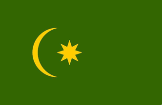 Image by Clay Moss, 18 August 2011
I came across this flag at our local flag store. It's not an original but a modern nylon replica. I think it might be some type of Ottoman flag, but I'm not sure. Can anyone help?
Clay Moss, 18 August 2011
A couple of years ago, we made something like this for a customer. He called it the "Ottoman Religious Flag." I found versions with varying number of points on the stars. We settled on a 5 pointed version. (seen here).
Rick Wyatt, 21 August 2011
Thanks Rick! The 5 pointed star version is common in Malaysia today and can be seen flying over various mosques. I'm fairly certain now that the 8 pointed star is Ottoman, or at least influenced by old Ottoman flag variants.
Clay Moss, 21 August 2011
Such green flags with crescent and star, in slight variations of the design, but basically green variant of the Turkish flag, are more or less regular inventory of mosques in the Balkans as well.
Occasionally, and especially during the Muslim holydays the may be displayed from outside the mosque or hoisted from the minarets. I remember such flags being used in Bosnia already in 70's (and
probably also earlier, but my memory doesn't go so far :) Obviously, they are intended to represent the Islamic faith.
Željko Heimer, 21 August 2011
 Image from Esteban Rivera, 21 August 2011
I came across this link displaying two Mexican flags (and the Mexican flag itself). Can someone help me identify the two flags which are in white background?
Esteban Rivera, 21 August 2011
The first one (on our left) seems to be that of the Estado de México (State of Mexico).
Chrystian Kretowicz, 21 August 2011
The flag on the left of the Mexican flag is the flag of the state of Mexico, the most populous state in the country, which almost surrounds the Federal District (i.e., Mexico City). I tried to do some research on the one to the right, and all I could come up with, is that it is the flag of a college in Ecatepec or Metepec (you can see "tepec" in the bottom of the coat of arms) , two of the most important municipalities in the State of Mexico. Perhaps someone could improve this information.
Juan Carlos Jolly, 29 August 2011
I got a better look at the flag, and on the top and the right it reads: "DE ESTUDIOS SUPERIORES" (of Superior Studies), thus it is truly a University flag. The only thing that comes to my mind when Juan Carlos mentions the ending "tepec" is Chapultepec, but none of that comes as a result when I seek University flags under that name. So I guess we're gonna need further assistance on this.
Esteban Rivera, 30 August 2011
I proposed Metepec, a suburb of Toluca, the capital of the State of Mexico, and Ecatepec, a suburb of Mexico City (and the most populated municipality
in the country), which are the only "tepec" municipalities in the State of Mexico large enough to house a college or university. "Tepec" means hill, mount, butte, promontory, etc., in Nahuatl (originally "tepetl," but mistransliterated in Spanish to "tepec;" hence "Ecatepec" (hill of winds), Metepec (hill of maguey plants), Popocatépetl (smoky mountain, keeping the Nahuatl spelling), Chapultepec (hill of crickets), etc. It is a very common suffix in Mexican toponymy. Chapultepec is not in the State of Mexico, but in the Federal District (Mexico City). That's why I don't think Chapultepec is the word in the flag. I personally think is more Metepec than Ecatepec, but that's just a personal guess. I'll keep looking.
Juan Carlos Jolly, 30 August 2011
Combining it all: This would be the flag of Tecnológico de Estudios Superiores de Ecatepec
Peter Hans van den Muijzenberg, 30 August 2011
 Image from António Martins-Tuválkin, 26 March 2016
This attached uses the ratio of the national flag, as suggested by the UFE photo, the logo taking up about 5/7th of the flag's height. The logo is described at the Ecatepec School of Higher Technological Studies website (Image) where it's said that its design has a triple meaning: It illustrates the Aztec language meaning of Ecatepec (Windhill); then it reminds of a local saltern complex nicknamed "the snail", due to its shape; and thirdly is is supposed to embody a whole lot of "claptrap" about technology and education.
António Martins-Tuválkin, 26 March 2016
This has been identified as President Desmond Hoyte's Flag (1985-1992) of Guyana.
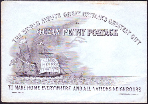 #47a
#47a
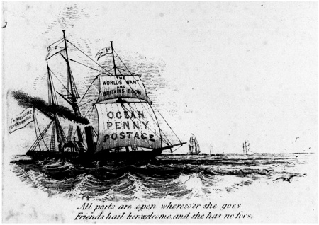 #47b
#47bI've come across a flag image printed on a British pictorial envelope, so it may never have existed in reality, but I was wondering if you or any of your colleagues might recognize it. I'm attaching the image (#47a), drawn by Henry Anelay for the League of Universal Brotherhood and in support of the Ocean Penny Postage movement in 1848. It's the one on the mainmast of the steamer (that is, the one that is not the British flag..).
A second envelope (#47b), stationary, actually, has a variant of the flag above . One may be correct and the other in error, or both invented again, I'm not sure.
Peter A. Shulman, Assistant Professor of History, Case Western Reserve University, 10 September 2011
Well, the stationary [#47b] obviously has the barquentine-rigged steamship One Penny, flying the house flag of the Ocean Penny Postage line. The company name is displayed on the fore course sail, as some companies did in the past, and the ship's name including part of the company name was also a common practice. That house flag, at least for ships flying the ensign of Welcome, appears to display the sealed reverse of an envelope. The pennant flying from the fore is clearly the One Penny's name pennant. Finally, the paddle box bears a representation of the company's purpose, if rather more crude than was usual.
The envelope [#47a] might be showing the One Penny too, or maybe a One Penny before or after her. Here too, she sails for the Ocean Penny Postage line, but at this time, she wasapparently registered in the country of Union, as she flies the Union ensign. This difference also seems to bring a different house flag, namely a white field with on it in canton the white reverse of an envelope, while even in this image the design is not clear enough to determine for certain whether it has a seal. Here too she flies her name pennant, but the paddle box does not seem to show any lettering, making it much more agreeable.
Considering that I don't know of the countries of Welcome and Union, I would declare these flags as complete fiction. In today's age, there would be a chance that the Ocean Penny Postage movement would in fact have had such flags made, but since this was around 1850, this would have been quite costly, and I think they would not have gone beyond the version in the prints.
There are several more versions of the print, by the way. I think the only flag-wise difference, apart from what we see here already, is that at least one version has the text on the ensign of Welcome reading "A WELCOME EVRYWHERE". The older versions are apparently those which show a design like that of the envelope, with the Union Flag as their ensign, where the British red ensign was flown by the real British mail ships. The choice may have been motivated by a desire to make it more understandable for Americans, as the movement existed on both sides of the ocean, asking for a one penny resp. two cent rate for the transatlantic leg of mail transport. Most mail between Europe and North America, here described as "The World", went through Great Britain, and the low rate would therefore be a benefit to all. The movement felt the resulting increase in mail flow would compensate the lower income per envelope.
While it is all just fiction, in my opinion, I would point out the details of the house flag. The saltire lines are drawn in such a way that they resemble an envelope, with a seal on it, yet the resulting flag cleverly mimics the flag of the actual mail company, the Royal Mail Steam Packet Co. (and the next entry on that page), which was a saltire bearing a crown. The depicted Union Ensign shows that the artist is quite capable of indicating thickness of saltires, even at that size, so the likeness to an envelope, rather than to the actual flag, is quite deliberate. It's also a quite enjoyable visual pun.
Peter Hans van den Muijzenberg, 19 April 2012
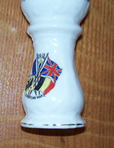 Image by Kirby Mohr, 3 October 2011
I've got an old piece of porcelain evidently from the first days of World War I, it is labeled "1914" and "European War." It's in English and shows the English, French and Russian flags and also one I can't identify. The flag I'm wondering about is at the bottom right, the yellow doesn't show too well, but I'm sure it's supposed to be yellow because of the Czarist flag on the opposite side. It has three vertical stripes, with black at the staff, yellow in the middle and red at the outboard end. Any ideas what that might be? I suspected Italy, but the colors don't seem right.
Kirby Mohr, 3 October 2011
My feelings is that it could not have been the Italian flag, since Italy didn't come into the war on the Allied side until much later than 1914. Most likely it was Belgium (black-gold-red), although they were neutral at first, the German path to France went right through them. When Germany rolled through Belgium in 1914, it began the war in earnest. The British came in joining France and Russia, so maybe that is why those four flag appear on the vase.
Pete Loeser, 3 October 2011
In August 1914, Russia declared war on the 1st, France on the 3rd, and Belgium and the UK on the 4th. Italy did not declare until 23 May 1915. As the vase says "1914," Belgium it is. The colors are clearly Belgium regardless. Also declaring war in 1914: Serbia 28 July, Nepal 4 August, Montenegro 8 August, Japan 23 August. Either these weren't considered for various reasons, and/or the vase was made in a very narrow window.
Nachum Lamm, 4 October 2011
Brave little Belgium...
Peter Hans van den Muijzenberg, 4 October 2011
Perhaps the fact that the Belgium flag is included as the fourth flag, might it not only suggest the date of manufacture, but also the place? I wonder if there any indication that it was of Belgian manufacture?
Pete Loeser, 4 October 2011
Thanks to all, I was expecting a very narrow window of manufacture as well. The glory of World War I only lasted a few weeks before the horror set in. It does have a manufacturer's mark on the bottom and is English. If you are interested, there is a very revealing book called "The Donkeys" that describes the atrocious generalship of the British and French forces.
Kirby Mohr, 4 October 2011
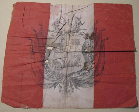 Image from Jennifer Jones,18 October 2011
Can anyone help identify this flag, now in the collections of the National Museum of American History? It seems to be an anomaly, due to the sun in the wreath, and the printing being outside the white of the field.
Thanks.
Jennifer L. Jones, Chair, Armed Forces History Division, NMAH, Smithsonian Institution, 18 October 2011
Here's some speculation. First, the overlapping arms are likely required by the squarish dimensions of the flag itself. It's worth noting that the sun emblem was known from early in Peru's modern history and is often seen on flags and proposed flags of Peru from the 1820s and from the time of the Peru-Bolivia Confederation in the 1830s. In the latter period, North Peru used the Peruvian national arms on its flag and South peru used the sun symbol. Could it possibly be the flag of some movement for a separate united Peru from this period?
James Dignan, 18 October 2011
The flag is obviously Peruvian. I have seen similar Spanish flags in the military museum in San Carlos castle (Porto Pi/Palma de Mallorca) a few years ago. A FOTWer, it might be Ian, denoted them as rucksack flags (colours of sheet, as usual, but the coat-of-arms just in black lines). We should have those flags within our Spanish pages. As far as I remember, they were from times of King Alfonso XIII.
Klaus-Michael Schneider, 18 October 2011
Perhaps you mean a Spanish Rucksack Flag. See Military Colours in the Military Museum of Palma de Mallorca.
Pete Loeser, 19 October 2011
Good recall! there are two more on Military Flags 1843-1931 (Spain).
Eugene Ipavec, 20 October 2011
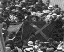 Image by Patricia Millar, 25 September 2011
I am curious about a flag in an image I am using in a thesis. The cropped image (attached) shows part of a crowd at the departure from Hobart, Australia, of the Australasian Antarctic Expedition in 1911. The flag is a dark background, light coloured saltire, with I think a harp in the lower left.
Patricia Millar, 25 September 2011
Not a flag I'm at all familiar with, and the presence of a harp (assuming that it is a harp) rather throws "the cat amongst the pigeons". The "harp" indicates a Irish connection, but theirs is (of course) a red saltire on white, without the "harp" however, one would automatically think of the Scottish flag (a white saltire on blue) defaced with a club badge (or similar)? There are considerably more saltires than just those two in the world (although the date would indicate a UK connection), so let us hope that someone with more expertise than I can come up with a definitive (or at least more acceptable) answer?
Christopher Southworth, 25 September 2011
My best guess is the obvious one - that the flag is the Scottish Saltire with the addition of a device that is unclear. Firstly, I have identified the source of the cropped image - it is a photograph of the Hobart Wharf half an hour prior to departure of the SY Auroroa. The photo was taken by Xavier Mertz, one of the expeditioners and it is in the collection of the State Library of NSW (aae_36779).
There are in fact two flags in the image, and whilst it is very unclear, the second flag appears to be the Australian Red Ensign, with only part of the fly visible in the photo. The saltire flag is slightly darker in shade, which would be consistent with it being a medium blue flag with a white cross.
Regarding the device on the flag, I do not think that it is a harp. If the alignment of the image is rotated, then I think that the device is more likely to be seen as a sailing ship - perhaps even a drawing of the Aurora. I think that the flag is being held upside down. If this is the case, then it would seem to be more logical for the device to be in the canton position (if the flag were held correctly).
The Australasian Antarctic Expedition of 1911-14 was funded by the Australasian Association for the Advancement of Science and by public subscription and donations. Given the prominent position of the flag in the crowd on the Hobart dock, it seems reasonable to me to speculate that the unknown flag was associated with the public fund raising efforts to support the expedition, than in a lower hoist position.
It is unclear as to why a Scottish flag would have been used as the base for such an expedition funding flag, as Douglas Mawson was an Australian (though born in Yorkshire) as were most of the expeditioners. The Steam Yacht Aurora was built in Glasgow, Scotland and was owned by the Dundee Deal and Whale Fishing Company - so the Scottish connection may have been related to the ship that would convey the expedition to Antarctica.
As an Australian vexillologist, I would of course be very interested to learn more about the two flags displayed at the dock-side at the start of this historic voyage of exploration.
Ralph Kelly, 25 September 2011
A harp indeed. See A harp in the South, Australian Antarctic Magazine, Issue 20: 2011.
Valentin Poposki, 25 September 2011
I'd assumed Valentin had his tongue firmly in cheek when he sent that message - like Ralph, I'm not even convinced it is a harp on the flag. Although Cecil Thomas Madigan was a meteorologist on the AAE of 1911-1914, it's his granddaughter, not Madigan, that is a harpist.
Jonathan Dixon, 21 October 2011
The whole image by Xavier Mertz has a slightly higher resolution, if you keep clicking, and it shows the
composition more clearly. I couldn't say what we're seeing; just that it doesn't turn into a ship when you turn it over. I couldn't even say for sure that whatever it is is on the cloth. A running smear, a tear in the fabric, something in front that the child further to the left is looking at, a very elaborate hat piece? I couldn't say.
On sixteenth look: This child and mother (?) seem to be almost the centre of attention. And the attention of the child and a backward look are directed towards something happening behind them. Is a chair half raised above the crowd, being carried towards there podium so the child can sit?
Peter Hans van den Muijzenberg, 8 May 2012
 #51a
#51a
 #51b
#51bI was hoping to get help identifying a couple flags. I think the first is a Lt. General´s Flag, but don't know the significance of the green color. I'm unsure if the other is a country´s flag or military?
Chris Price, 7 November 2011
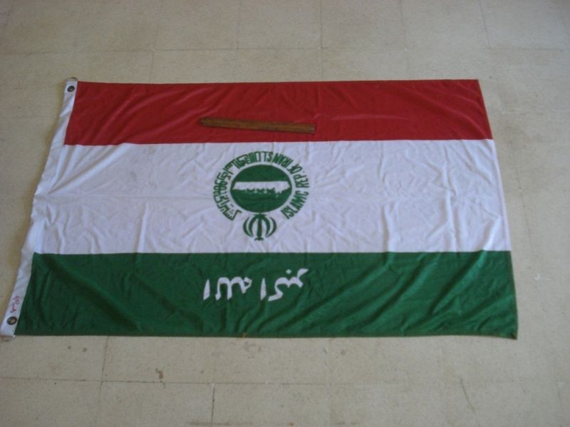

I've never seen this flag before, which appears to be some type of a flag of a shipping company maybe...it even has some English on it, reading "Islam Rep. of Iran." Anybody read Farsi? The e-Bay seller is based in India and apparently gets flags from vessels being salvaged. Most are made of the high-quality (and durable) nautical polyester, and more times than not, they're mostly applique/sewn. I'm pretty sure the flag is upside down. The brown thing, I think, is a ruler.
Dave Martucci, 20 November 2011
Looks like "S.L." after that - it's the Islamic Republic of Iran Shipping Lines. I can't reach their website
Jonathan Dixon, 20 November 2011
Definitely upside-down; the script says "Allah Akbar."
Albert S. Kirsch, 21 November 2011
I note that another one of these flags has just been sold by the same seller, but with the "I.R.I. Shipping Lines" as the English text, confirming that both versions of the logo have been used in flags of the company.
Jonathan Dixon, 7 December 2011
A further version of the flag is shown on the page "Iran–Shipping Lines" under Islamic Republic of Iran Shipping Lines with the image by Ivan based on a 1986 sighting by myself. As I have stated in the text for this over a dozen differing versions had been reported. These reports were to Louis Loughran of the World Ship Society from his network of spotters up until 1986, so it is likely that others were subsequently received. My version had inscriptions in both English and Farsi, which I assumed meant the same, though I have no idea of what the inscription on the upper green band meant and indeed the straight lines of it look a bit odd to me, but they were taken from an inscription which appeared on the website in 2004 (see image). The version found by Dave is thus one of the variations with the central design remaining standard, but the version found by Jonathan proves that even the English portion has either been changed or is subject to variation though the Farsi seems to be unchanged. In addition his discovery, apart from having equal bands, has no inscription on the green band which makes this version in line with that shown by Brown 1995 although the size of the image there is too small to define the lettering around the emblem.
Neale Rosanoski, 17 December 2011
A correction to my earlier comments after I have rechecked my sightings records and responses. The large number of variants recorded for the company applies to the funnel portions of the liveries not the flag. My sighting of the flag flown 17.3.1986 records an inscription of 5 parts [based on watching a flag flying from the ship] and on reflection this was probably the flag recorded by Dave with its 4 part inscription. The flag shown on the Iran page for the company was an assumption made by me based on the funnel design of the "Iran Mofid" 17.5.1991 by which I have assumed that this equated to the flag. Whilst I am sure of the inscription appearing on the green funnel band the ship was not flying a flag, so it is quite possible that while funnel variations abound, that this upper inscription may not have appeared on a flag i.e. the only definite variations known are the two covered in the "Unidentified" pages. My apologies for misleading.
Neale Rosanoski, 17 December 2011
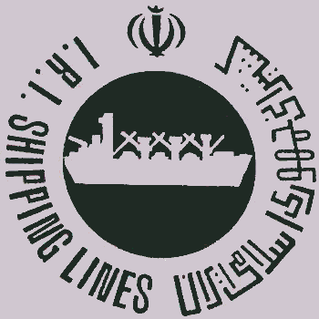
 Images from Neale Rosanoski, 18 December 2011
What one came up with 25 years ago and what has now surfaced makes certain assumptions made at the time now all out of kilter but at least it shows that answers can be found even though they may take some time. I have gone back again and followed things through and pondered a bit and as my first comments and subsequent back tracking leave a somewhat confused picture in places I thought it might be easier and I rehashed everything I sent in the following to replace the earlier two efforts. I think it has worked better than I hoped because I reckon I have worked out the connection of the straight line inscription that is shown by Ivan's image under Iran based on my info. He has got the Farsi inscription pretty well right in the image allowing for the difficulty of trying to get it into the image even with the size you use - no way with my small ones. But I have taken this opportunity to send in an image from a funnel which my be of interest or help if anyone wants the really fine detail and also supports the flag which Jonathan found.
Unidentified Flags or Ensigns (2011) Page 3: No. 52 Iranian UFE. The flag image provided by Dave is in line with a flag flown by the "Iran Fallahi" 17.3.1986 although then I was unable to make out the detail of the inscriptions apart from that the one on the green band appeared to consist of 5 components rather that the 4, [or is it 3?] shown in this actual flag. On 17.5.1991 I saw the "Iran Mofid" which did not fly a flag but appeared to have the equivalent as it funnel design i.e. a white funnel with narrow white and red bands with a wider stretch of white between them and on the white the design of the green circle with a white ship, the circle being ensigned with the green National Arms and encircled with inscriptions in green, that to my left being in English as "ISLAMIC REP. OF IRAN S.L." with that to my right being in [what I assume is] Farsi, whilst on the green band was a longer [or so it looks] Farsi inscription comprised of straight lines and which was forwarded with my original message so I will not repeat it but I now wonder whether, although it looks longer, it is not meant to also represent "Allah Akbar" but looks different because it is in straight lines rather than the flowing script shown on the flag. For this sighting I was using a new monocular sight rather than just ordinary eyesight or the previous small binoculars previously used so I was able to get a lot more detail noted.
I subsequently note that I found this inscription in straight lines on the company website but that it was not shown on a later visit 14.11.2004. In meantime I assumed that the funnel design was the same as the flag and while in most cases I would probably be correct, in this case I now think I was not. I have a collection of funnel photos now with several variations of funnel designs with about half omitting the inscription on the green band whilst the English around the main emblem varies with "I.R.I. SHIPPING LINES" appearing on a couple but there does not appear to be any connection with whether the inscription upon the green band appears or not. I have not found any more straight line versions of "Allah Akbar" but some have an extra "dash" above one of the "pieces" [see attached logo and emblem above]. So the flag found by Jonathan with its differences is in line with the funnels of some of these vessels although not for having equal bands. So far the reasons for the changes are not obvious though something may come up as I trace back through the ships. This straight line inscription on the green band was sent to FOTW and resulted in the image made by Ivan which appears on the page "Iran – Shipping Lines" under "Islamic Republic of Iran Shipping Lines" and it would probably be appropriate to change to the flowing version of "Allah Akbar" rather than my straight line version.
There is still the problem of the version shown by Brown 1995 where the green circle has become a green ring enclosing a green ship rather than white on the green circle but with all the variations around who knows.
Neale Rosanoski, 18 December 2011
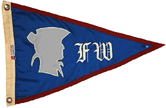
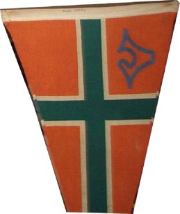
Can you help identify this burgee, which is probably from a yacht or boat club. A note attached to the burgee says "Fort Washington Yacht Club." I have found a record of such a club, but it has a different burgee.
Tom Cox, 26 November 2011
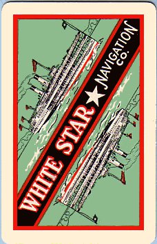 Image from Jan Walls, 2 December 2011
I collect shipping lines playing cards and today, I received in the post an old sample playing card book with this card in the scan, I am not sure if it is the Cunard Line or White star Line or maybe a new line that we collectors have never seen before (this card is new to us all) I also have 4 huge folders that I have compiled with histories, flags, funnels, old maritime timetable images and scans of all the playing cards that go with each line, the playing card collectors in our club APCCS have helped and lent me cards to add to the pages so that we have a history on all shipping lines. It has taken me years to compile. I hope you can help me with finding out something about this card as all the research I have done today doesn't show Cunard or White Star Line having a picture with the stacked paddle steamer. If not maybe you can put me onto someone else that might be able to help?
Jan Walls, 2 December 2011
I suppose the White Star Navigation Company in question was the one active before WWII on the Great Lakes, operating from Detroit. Does anyone know on what background colour the star appeared?
Jan Mertens, 3 December 2011
You are most probably correct, but just for the record there was also a White Star Navigation Company which operated vessels on Lake Coeur d'Alene, Idaho, US. As for the Great Lakes company, an image of a piece of crockery from one of its vessels, the Tashmoo, shows a monochrome flag - light field, dark disk, and white star, with WSL in the star. However, this print of the Tashmoo shows the field red, the disk blue, and the letters red (note different placement of letters).
Ned Smith, 3 December 2011
The White Star Navigation Co. noted by Jan was based Detroit being incorporated 25.5.1925 as a successor to the White Star Line and traded until 1930 apparently on the Detroit and St. Clair Rivers. Assuming that the cards belong to this company and looking at the card image I would say that the flag was black with a white star with the vessel also flying a red pennant from the mainmast which would presumably bear the vessel's name. The funnels are white with black top.
To me the vessel on the card looks more likely to belong to this Detroit company than the type shown on the Museum of North Idaho website as used by the Lake Couer d'Alene, Idaho company of the name which appears to have been taken over in 1908 by the Red Collar Line.
The vessel "Tashmoo" noted by Ted with its flag is in the colours of the White Star Line of Detroit incorporated 14.4.1896 and declared bankrupt in 1925, being succeeded by the White Star Navigation Co. The lead to the print of the vessel shows yellow funnels with black tops and a blue flag at the bow with a white pennant presumably bearing the vessel name in red at the masthead and thus differs from the playing card. However the flag image shown differs slightly from that shown by Lloyds 1904 under the name of White Star Co. where the letters are "WS" over "L" unlike the print version which shows "W" over "SL". The Lloyds version is supported by a cream soup plate shown on the Restaurant Ware Collectors Network website.
I would say that the vessel of the playing card is "Tashmoo" when comparing it with the 1907 print shown at Tashmoo (sidewheeler) on Wikipedia, thus making Jan's allocation the correct one.
Neale Rosanoski, 17 December 2011
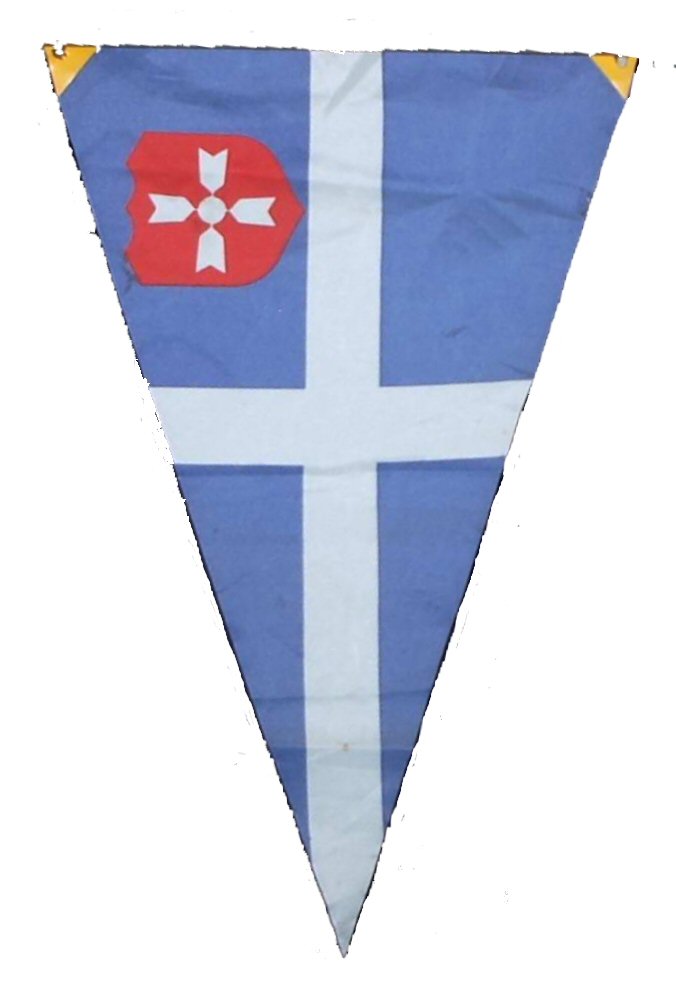 #55a
#55a
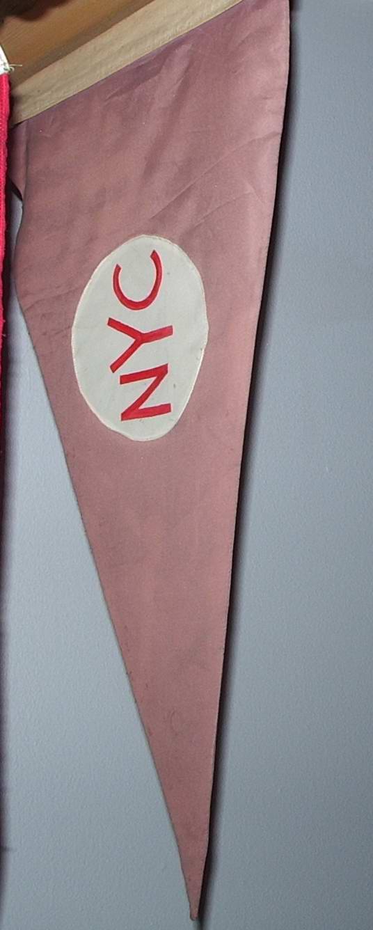 #55b
#55b
 #55c
#55c
 #55d
#55dI was the Commodore for South Coast Corinthian Yacht Club in Marina del Rey, California, in 2010, and for the last 5 or so years I have been maintaining the catalog of our burgee collection. I have four Burgees that I cannot identify, which I assume come from yacht clubs or a sailing association. I would LOVE your help getting them identified. The burgee #55d might be the White Star Shipping Line.
Bruce Fleck, 8 December 2011
 Image from Valentin Poposki, 9 December 2011
Here is one more Iranian UFE that needs identifying.
Valentin Poposki, 9 December 2011




These decorative Third Reich banners and the resulting discussion can now be found as examples of other NSDAP banner designs.