
Last modified: 2016-05-27 by pete loeser
Keywords: ufe | unidentified flags | 2013 |
Links: FOTW homepage |
search |
disclaimer and copyright |
write us |
mirrors
Please note our Policy for Submissions and Enquiries.
Below is a series of images of flags that have been provided to FOTW; some we have recognized, and some we have been unable to recognize. If you can help us identify any of these flags, please let us know! Contact the: UFE Editor.
Identification Key:
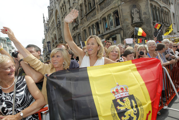 Image from Juanito C., 20 July 2013
While reading the news about Belgium King Albert and how he is gonna abdicate and his son Philippe will become King. There was some photos added to the news and I saw one that I haven't seen or have known to exist. The flag in question is the Flag of Belgium and in the center which would be the yellow bar on the flag there is the Small Version of the Belgium Coat of Arms however it doesn't include the two crossed scepters and the crown is silver/white.
Juanito C., 20 July 2013
This is the "new Belgian flag" designed - and sold - by the Belgian Alliance. The emblem in the middle of the flag is derived from the lesser version of the State coat of arms of Belgium. The scepters are omitted, the crown and the scroll is duplicated with the State motto in French and Dutch. The Belgian Alliance was founded in 2008 in Bruges as a national, multilingual party. The main objective of the party is "to unite the Belgians who defend and apply a policy based on tolerance, pluralism, solidarity and democratic principles". The party "rejects any kind of separatism or blind nationalism, be it Flemish, Walloon or German-speaking."
Ivan Sache, 22 July 2013
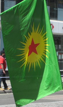 Image from Mark Brader, 10 July 2013
On May 1 this year, when Communists and socialists often hold events, I happened to be at Trafalgar Square in London, and I photographed someone carrying a flag I hadn't seen before.
You have a Koma Komalen Kurdistan flag on FOTW with 40 points, alternating long and short, on the yellow sun, and below it you also have flags with 21 points on the yellow sun, differing in the orientation of the red star.
The version I photographed is a combination of the first and third of these: it has 42 points, alternating long and short. As far as I can tell from the photo, the orientation of the red star and the long points of the yellow star matches your third flag, i.e. the former has one point straight up and latter has one straight down.
However, it looks slightly inexact, as though either it was at least partly handmade or else there is some deliberate slight asymmetry. And since it's being hand carried, the "up" direction isn't 100% clear. The colors look closest to the third one on your page.
Mark Brader, 10 July 2013
The flag with 42 points (alternate long and short) seems to be the official one of the Group of Communities in Kurdistan (KCK).
Jeroen van Leeuwen, 13 November 2015
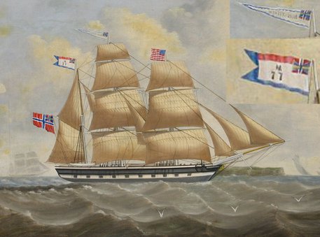 Image from Vin Florentino, 11 August 2013
My primary interest is historical US flags, but at this time I am trying to identify, to no avail, the British flags on the attached oil painting (from the mid 1800's). Because of the Red Ensign, (in a configuration I have never seen) I assume it is a merchant ship (but the why are there gun ports?) as to the two pennants, I have no idea. Any help, even if it is just to point me in the right direction, would be greatly appreciated.
Vin Florentino, 11 August 2013
This ship is flying colours of the of the Union of Norway and Sweden of the period 1844-1905. I believe a merchant ship would have used the flag so it is probably a naval vessel. I don't recognise the other two flags. I have attached a reduced version of the painting, with the two unknown flags enlarged.
Rob Raeside, 11 August 2013
A correction: this looks like the Norwegian Merchant Ensign (Union of Norway and Sweden of the period 1844-1905); the naval ensign would have three swallow-tails. Still no idea about the two other flags though.
Miles Li, 11 August 2013
Since this is a Norwegian merchant flag (rather than a Swedish one), shouldn't that be 1844–1898 (effectively 1899)? I'm sorry to say that I can't identify the other two flags either, although the
the thought occurs (probably wrong) that the one on the mizzen might be an insurance flag, and the one on the main a house flag?
Christopher Southworth, 12 August 2013
In the early 19th century it was not uncommon for civilian ships to be painted like warships; so the ensign is more significant for the use than the colours of the hull. The American flag on the foremast is likely courtesy flag indicating the nationality of destination - steamers do so today when entering foreign ports. The flag on the mainmast is either a house flag or the indication of some official purpose, e.g. carrying mail, as it bears a canton of the Norwegian/Swedish Union badge - someone from Scandinavia will probably recognize it.
Michael Halleran, 12 August 2013
In was not uncommon in the late 19th and early 20th centuries for merchant ships to fly pennants bearing their ship names, although what is somewhat unusual in this case was the inclusion of the Union Mark onto the pennant.
Miles Li, 12 August 2013
To summarize:
1. From the gaff flies the Norwegian Merchant Ensign 1844–1898.
2. From the fore flies the Stars and Stripes as a courtesy flag. The number and pattern of the stars can not be made out in the image, which is unfortunate as it could have given us a time-frame.
3. From the main flies a name pennant. It bears the ships name, which I unfortunately can't make out; it would be nice if we could find out the name of the ship, if it can be made out on the painting or is documented somehow. The inclusion of a national corner in the design of the name pennant is uncommon, but not unheard of. I have never noticed any strict pattern to it, apart from the impression that the oldest name pennants have no decoration at all, hence also no national corner. Note that while normally the national corner is a small version of the national flag or ensign, here it's the union mark appearing in the Norwegian flags.
4. Flying from the mizzen is what appears to be a registration flag. As it happens, we just had another identification request for a registration flag. I won't bore the list with the same explanation again; suffice it to say that it indicates some register, often a mutual insurance, and that each ship would fly a flag differing only in the registration number. For the previous request (see UFE13-31) we had the names of ships, their origin, and the time-frame; in this case, without even the name of the ship, it's going to be difficult to determine the register.
Peter Hans van den Muijzenberg, 5 September 2013
[Going by our criteria, which requires a positive identification "beyond reasonable doubt", I'd say the last flag in the painting has not been completely identified. Although it probably is most likely not a company flag, but a registration flag, we still don't know the ship or Norwegian company that it is associated with, so we must still consider this a Tentative ID. - Ed]
 #37a
#37a
 #37b
#37b
Images from Matthew Targaryen, 13 August 2013
[I assume Matthew wants to know if these flags have any basis in reality - Ed]
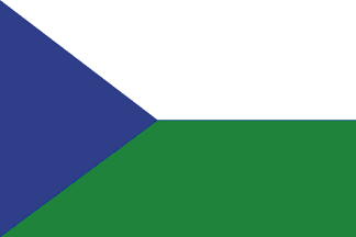
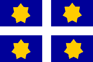
This unidentified flag (#37a) was seen on a film shown on TV. I can't remember the title of the film, but I remember it's a movie about mercenaries. The plot is based on a U.S. Rangers team, based in a military facilities on East Europe, faced a mafia leader in Eastern Europe, who conspires with his army to take over a small country called Petrosia. Supposedly, this flag is the flag of Petrosia, where the story occurs.Following up on your message earlier today, would you be able to remember the rough year and/or actors in it the film?
Rob Raeside, 1 August 2013
Sorry, I don't remember.
Matthew Targaryen, 1 August 2013
Another flag (#37b) was seen in the 2nd season of the Australian TV Series "Sea Patrol". It's supposedly the flag of the Samaru Islands, an archipelago placed in Oceania, near Australia and New Zealand. Samaru, a typically Hollywood-style Pacific-area nation: people mixed white, insular natives and black, local order forces corruptly and incompetent, illegal weapons trade, political issues, etc. In the story the "Sea Patrol" team visited this country during a pacificate operation supported by Australian government.
Matthew Targaryen, 13 August 2013
Don't know about the synopsis, but could the film be "Air Strike", and the country's name "Petrovia"?
Peter Hans van den Muijzenberg, 18 August 2013
Matthew confirmed off-list that the name should be "Petrovia". He checked a synopsis of "Air Strike" and agrees that this is the film in question. He points out, though, that we'll have to mention the year, 2004, when referring to it, as the title was used previously for a 1955 post-Korean War film.
Peter Hans van den Muijzenberg, 18, August 2013
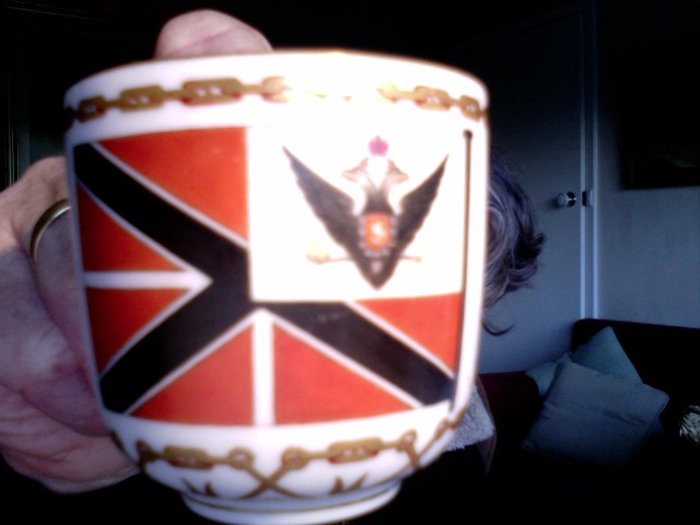
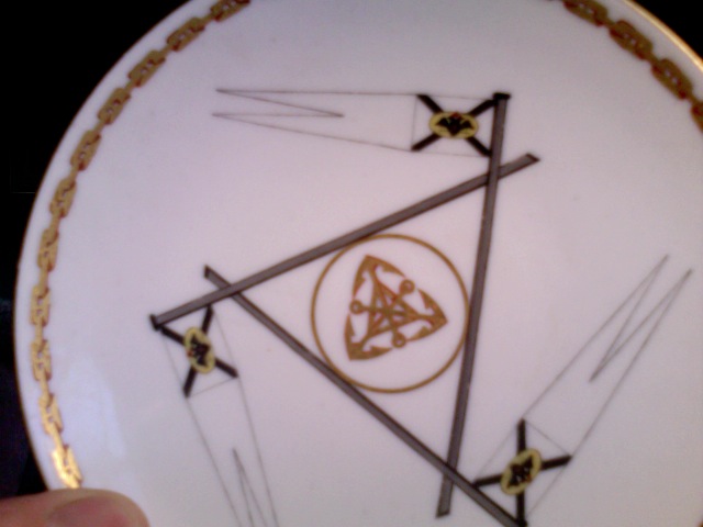
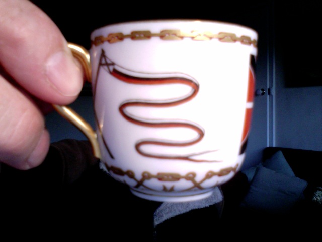
Images from Gray Ramsey, 14 August 2013
I'm trying to identify a flag on a cup and saucer from Alexander II period (1855-1871) So far worked out (I think) the following:
- Orange and black navy jack mean it is from a guard.
- The yellow circle with the c of a over a black cross is very similar to the broad pennant of the grand duke general-admiral.
Other than that, I can't find anything exact. Any chance you can help?
Gray Ramsey, 14 August 2013
I suspect the "orange and black" on the cup are representative of red and dark blue, in which case it falls in the general category of Personal Standard of the Heir of the Throne, although the placement of the COA is different. As you note, the pennant is like the Pennant (1743-1865).
Rob Raeside, 14 August 2013
An orange and black navy jack never existed in the Russian Navy and it must be the regular red-blue jack. I think it is probably the flag of an Extraordinary Ambassador (adopted in 1833. readopted in 1870). I think you are right and the second flag is the broad pennant of a Grand Duke General-Admiral.
Victor Lomantsov, 18 August 2013
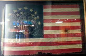 Image from Mark Keaton, 18 August 2013
I saw this flag in the Ronald Reagan building/ITC in DC and can't remember what it is. It's looks different to the "Indian Peace" flag, but very similar.
Mark Keaton, 18 August 2013
As a foreigner, I have no idea whether the Ronald Reagan building/ITC in DC is something one could ask about a flag present there. If so, the most effective method of flag identification would be available. Other than that, we do have a page for Eagle flags. Are other people also getting the impression that the canton is stitched in the wrong way round?
Peter Hans van den Muijzenberg, 18 August 2013
The eagle is "voided", as in the Fremont flag. Does this suggest any idea to anyone?
Tomislav Todorovic, 18 August 2013
According to Jim Ferrigan this flag has been around for some time and has gone through several transformations. It's most recent variant is currently available from the Gallery of the Republic. It is a stylized copy of the Eagle Canton flag owned by the New York Historical Society. Both the Gallery of the Republic version and the Ronald Reagan building/ITC version in Washington, D.C. are based on the 18th Century New York Historical Society flag. In short, the copy being sold by Gallery of the Republic, and the copy at the Reagan Building are both replicas (of the NYHS original) manufactured by the Gallery of the Republic.
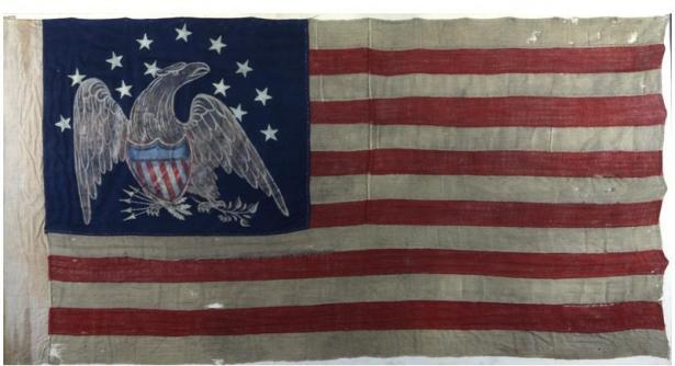 Image of original at the New York Historical Society
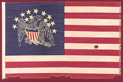 Image of replica sold by the Gallery of the Republic
See also this DoV entry about these flags.
Christopher Southworth, 7 September 2013
I came across a related article about a flag presentation in Jefferson County, Washington. Two State Supreme Court justices presented a flag to be displayed in the courthouse.
The first article I saw was in the Peninsula Daily News, but I didn't make the connection until I saw the follow-up article with a picture of the presentation. It's another "Great Seal" flag from Gallery of the Republic.
The second article (with picture) was also in the Peninsula Daily News (here) was titled "A historical flag for Jefferson County."
Andy Shelton, 5 December 2013
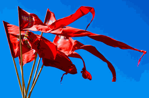 Image by Ian Stewart, 28 August 2005
I don't know what these pennants stand for.
Elias Granqvist, 8 September 2013
I don't know either. There seem to be rather colourful charges in a cross-like pattern on them, though; they are not just red.
Peter Hans van den Muijzenberg, 8 September 2013
Can we get any more information about where Ian Stewart was when he took this 2005 photo?
Pete Loeser, 10 September 2013
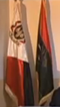 Image from Jaume Ollé, 20 September 2013
In a feature on the Catalan TV today I saw a strange flag of Libya; which may be a judiciary or similar flag because Gaddaffi's son is speaking of the judice for Sayf al Islam. The flag is diagonally divided from lower hoist to the upper fly. The upper hoist of the flag is white bearing a shield or emblem; the lower part of the fly is divided forming two triangles: at left is red and at right is black. Next to it is another flag that seems to be the National flag; red over black over green with half moon and star. Both flags appear on poles and also as table flags.
Jaume Ollé, 20 September 2013


Images from Tomislav Šipek, 24 September 2013
I lost the web-page address where I found this picture, but here is the original picture and an image of the unknown flag I'm trying to identify. The image was named "dantai200721 saga prefecture" - perhaps Saga Prefecture corr... Saga Prefecture alternative?
Tomislav Šipek, 24 September 2013
The flag is simply (and correctly) identified as an alternative flag(oid?) for Saga Prefecture, showing the prefectural logo in white on a green field. The logo has a full circle on top of a half-circle, with arcs either side giving the appearance of more discs. It was adopted on 18 May 1992. It expresses the plentiful land and sea of Saga prefecture. The central circle(s) represent the rich past and a society naturally, with a focus on people, being in sympathy. resonating together and symblises the filling of possibilities. It also shows Saga on a stage, where the citizens interact with the people of Japan and the world, resonating together.
As for the photo showing the mark used in a flag context: The image is as helpful as the page - it's at the 2007 National High School Athletics Meet, in particular the weightlifting, which was held at the World Ceramic Exhibition Memorial Hall in Arita, Saga prefecture.
It's then not surprising that the flags are: Saga prefecture logo flag. All Japan High School Athletic Federation Japan Japan Weightlifting Association (fairly clearly - I didn't search for confirmation of the logo).
Jonathan Dixon, 26 October 2013
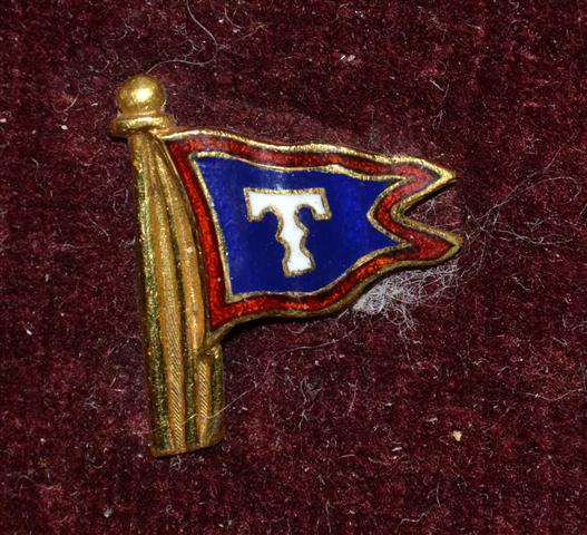 #43a
#43a
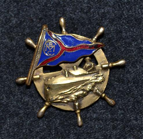 #43b
#43b ![]()
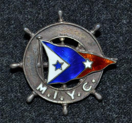 #43c
#43c ![]()
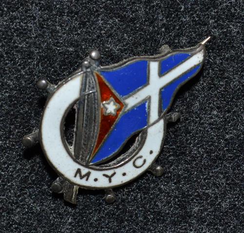 #43d
#43d ![]()
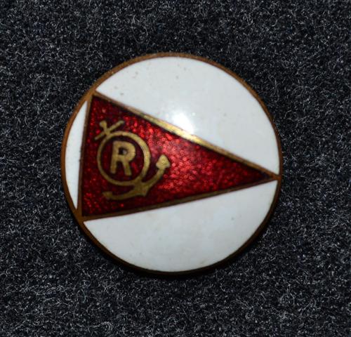 #43e
#43e
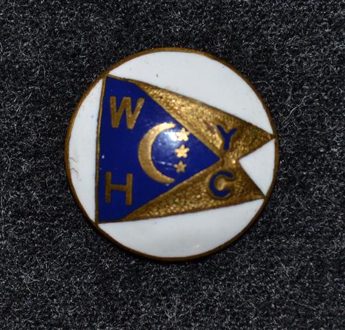 #43f
#43f
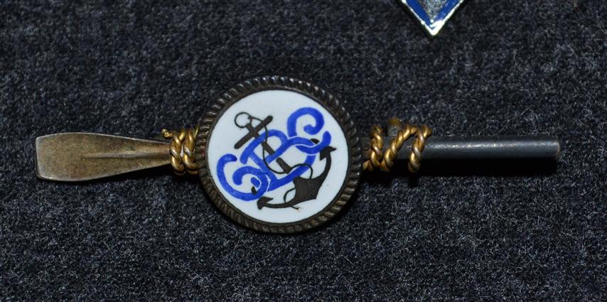 #43g
#43g
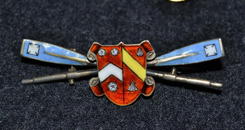 #43h
#43h ![]()
Images from Tobias M. Sullivan, 27 September 2013
Context is always important for identifying unknown flags, and I see you are in Maryland. Is it fair to assume there is a greater likelihood these are east coast US yacht clubs, or does your collection include pins from all over the US or world?
Rob Raeside, 1 October 2013
I usually feed my addiction through ebay so stuff comes from all over, but mostly from the Northeast and Great Lakes Regions which is where I would guess the lion's share of yacht and boat clubs exist(ed). The only thing I can add is maker marks if any. Most of these are in the higher end of my collection so alot of them or sterling or classy enough to have a maker's mark. While I've had US pins with British marks and New England Pins made in the mid-west, they are usually are pretty made close to home.
Without the monogram [#43g] would be the British Motor Yacht Club. Perhaps the club used to be the British Motor Cruising Club?
David Prothero, 2 October 2013
If [#43g] is a cap badge, it could equally well be (Some Thing) Company. Maybe it's even "centre". "Boat clubs" tend to be rowing, so maybe "boating club".
On [#43h] the arms appear to be those of Wadham College. If those are oars behind the arms, that would suggest Wadham College Boat Club. I don't see anything suggesting they use those arms, though, but if not, they might know more.
Peter Hans van den Muijzenberg, 2 October 2013
Wadham College! Fantastic. I don't how you know that, but thank you. The arms are Wadham and the oar blade design is their team - Wadham College Boat Club [#43h]. Thanks! One mystery down.
Tobias M. Sullivan, 3 October 2013
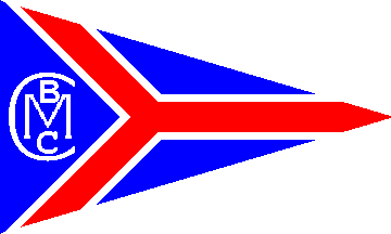
Unidentified CMBC Burgee [#43b]
Image by Peter Hans van den Muijzenberg, 5 October 2013
David Prothero has suggested that without the monogram it would be the British Motor Yacht Club and perhaps the club used to be the British Motor Cruising Club? Maybe, instead this is the result of a merger?
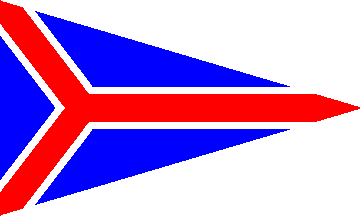
British Motor Yacht Club Burgee
Image by Peter Hans van den Muijzenberg, 5 October 2013
On Ebay, a "British Motor Yacht Club Dinner Dance - Menu 1938" is on offer, which shows quite a different burgee. It looks like red over white, over all a blue disk fimbriated red bearing a yellow three-bladed propeller.
Currently, as David points out, the BMYC has a blue burgee with a red tricross fimbriated white. The club is included with this design in Yacht Club Burgees by Colin Stewart, 1957.
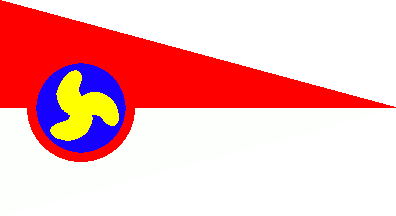
Old British Motor Yacht Club Burgee
Image by Peter Hans van den Muijzenberg, 5 October 2013
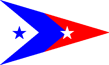
Burgee of Manhattan Island Yacht Club on pin [#43d]
Image by Peter Hans van den Muijzenberg, 12 November 2013
OK, knowing that we're talking about Manhattan, it's not all that difficult to read "Manhattan Island Yacht Club". Indeed, Lloyd's Register of American Yachts 1906 shows a similar design burgee for that club. The pin shows a triangular burgee, approximately 3:5, with a white hoist triangle with an apex of 80 degrees, then a blue chevron of a similar depth, and the rest of the flag red; a white five-pointed star pointing upwards on the apex of the blue, and a blue one of the same size in the hoist triangle.
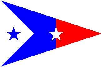
Burgee of Manhattan Island Yacht Club, Lloyd's 1906
Image by Peter Hans van den Muijzenberg, 12 November 2013
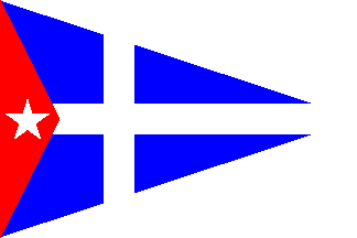
Burgee of the Metropolitan Yacht Club [#43b]
Image by Peter Hans van den Muijzenberg, 13 November 2013
The cause of that meeting reported 9 August 1908 in the New York Times, that I mentioned yesterday, was that the Metropolitan Yacht Club was refused a new lease for their site in the Pelham Bay Park. That conflict in itself may not be of great importance to us, but the fact that this club has the initials MYC certainly is worth a closer look.
And indeed, though I don't know have a coloured image, Lloyd's Register of American Yachts 1917 does show the design of the old Metropolitan Yacht Club of New York as a light narrow cross on dark, with a lighter dark shallow hoist triangle bearing a white five-pointed star pointing up. That's a good match for the design on the pin: A white narrow cross on blue, with a red shallow hoist triangle bearing a white five-pointed star pointing up.
Searching the Internet, quickly shows the club existed before that, as 17 September 1905 the NYT reported them as one of the clubs who formed the new Corinthian Yacht Racing Association. Digging further brings up the Evening World of 21 May 1903, reporting on the Metropolitan Yacht Club's first meeting after organisation, at their club house that previously was the home of the Harlem Yacht Club. (A quick peek at the HYC website shows this to have been the Randall mansion in Harlem.)
The club was listed in LRoAY 1917. I saw no later mentions on the Internet, though, and post-WWII burgee overviews do not list the club.
Peter Hans van den Muijzenberg, 13 November 2013
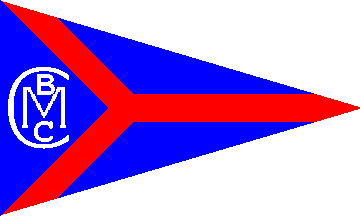
Burgee of the Chicago Motor Boat Club (according to Lloyds)
Image by Peter Hans van den Muijzenberg, 15 November 2013
There really was a Chicago Motor Boat Club. Lloyd´s Register of American Yachts of 1917 shows its burgee. The illustration tells us that on the pin the ridges between the red and the blue are merely separations, not white stripes. This results in a triangular blue burgee with a red tricross, in the hoist triangle a "C" encircling an "M" with above it a smaller "B" and below it a smaller "C", all white.
Searching the Internet gives us as the earliest reference a picture of "Chicago Motorboat club on Lake Michigan at foot of Washington Street 1905", apparently showing the club's floating clubhouse.
The Chicago Daily News Almanac and Year-Book for 1922 uses that same spacing as it reports on the results of the Chicago Motorboat club's annual regatta of 2 July 1921.
The four word spacing seems to have been official, though. The Web Archive's texts section has the Chicago blue book of selected names of Chicago and suburban towns. In 1905, which would match the photograph, in the Chicago Blue Book the club is not one of the selected names. However, in 1909 it makes its first appearance as: CHICAGO BOAT CLUB Meets 1st Mondays at Lincoln Park.
By the Chicago Blue Book's final, 1915, edition, the entry had changed to: CHICAGO MOTOR BOAT CLUB - Club House, Lincoln Park Lagoon.
Over the years, newspapers reported the club going on various fleet visits, like in The Milwaukee Sentinel of 24 July 1930 where they visit the port of Menominee. This is also the last year for which I found references to the CMBY; it may be the existence of the club ended shortly afterwards.
While it was a nice theory that this might have been a burgee of the "CMBC" before its merger with the BMYC, this was based on the similarity of the burgees, and without the fimbriation there's far less similarity. Considering that the clubs are also on different continents, I guess we can put this theory to rest.
As we still don't know how the British Motor Boat Club changed burgees, I'm once again copying this message to The River Club, though so far I've not had any response, their website is still down, and I'm beginning to wonder whether the club is still in existence at all.
Well, that's it as far as this group of yacht club pins is concerned. The last burgee that has a YC ending to its abbreviation, that of the WHYC, is in a different style. I would expect it to be either from a different time or from a different area. The pin itself appears to be similar to [#43e], R inside an anchor, though. If that's really the case they might belong to somewhat related entities.
Peter Hans van den Muijzenberg, 15 November 2013
I don't think that the British Motor Boat Club has any connection to the original question; but for the record. It was formed in 1904, and affiliated with the Royal Motor Yacht Club in 1929. In 1933, the Royal Motor Yacht Club wrote to the Home Office, "British Motor Boat Club will cease to exist and trade trophies will be abandoned. Request permission to change Royal Motor Yacht Club burgee to that of British Motor Boat Club with added crown, if this would not cause any difficulty."
The Home Office replied "No objection to continued use of royal title and accordingly a crown may be displayed on the burgee." The burgee of the Motor Yacht Club in 1906 was blue/white /blue with a red propellor on the white.
In 1910 it became Royal Motor Yacht Club and a crown was added in the upper hoist. The burgee of the British Motor Boat Club was blue with a white edged red saltire.A crown was added on the centre of the saltire in 1933.
David Prothero, 15 November 2013
I agree, as I meant to write British Motor "Yacht" Club. And even that, we've now seen, is unlikely to be involved.
Curiously, the RMYC history page has it that the RMYC was started May 1905, yet that the BMBC "had been running for almost the same amount of time". While this is true if taken literally, it usually expresses a slightly "shorter" time, but it appears that the BMBC was in fact the older club.
Unfortunately, the RMYC history page doesn't reach that time yet. There is an announcement telling us the part will be covered "over the next few months", but the page is from 2009. I fear something may have happened to the writer. I'm copying this message to the RMYC, in case they can help us.
This appears to be common for absorbing a club: The disappearing club lives on by way of its burgee. It's slightly complicated here by the fact that the BMBC did have permission to use a (the?) blue ensign, but had been denied several times the title "Royal". We've mentioned for other occasions that a crown was added to a burgee as the club became "Royal". Here we see that this was actually considered a privilege deriving from that title.

Burgee of the Motor Yacht Club
Image by Peter Hans van den Muijzenberg, 17 November 2013
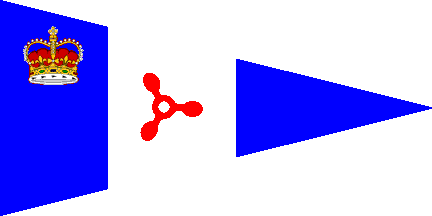
Burgee of the Royal Motor Yacht Club
Image by Peter Hans van den Muijzenberg, 17 November 2013
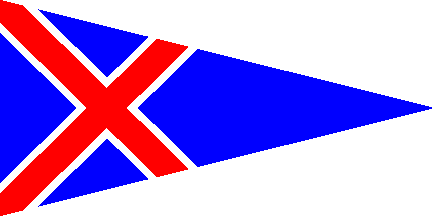
Burgee of the British Motor Boat Club
Image by Peter Hans van den Muijzenberg, 17 November 2013
I did not include all the information that I have on the British Motor Boat Club, in my message of 15 November as it is not particularly vexilological, but having it may fill a few gaps. From National Archives Home Office document HO 144/10105, titled: ‘Royal Yacht Clubs’ in the section, ‘List of Clubs which have applied without success for the title Royal.’ you'll find this about the British Motor Boat Club.
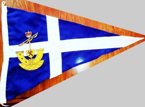
This is the Burgee of the Royal Galway Yacht Club and located on it's proper page.